


Data 101: Unlocking Insights to Improve Construction Projects

Throughout the resource, we’ll reference insights found in the the Dodge SmartMarket Brief: Optimizing Construction Technology for Owners
Explore common challenges and effective solutions construction owners face in capturing and utilizing data to unlock valuable insights and improve project outcomes. This resource will guide you through the digital transformation journey, highlight the significance of fostering a data-driven culture, and share best practices for creating impactful dashboards.
Download the SmartMarket Brief
Table of Contents
- The Digital Transformation Journey
- Common Data Challenges
- Ingredients for a Data-Driven Culture
- Data Warehouses: The Backbone of Data Accessibility
- Best Practices for Dashboard Creation
- Case Studies
The Digital Transformation Journey
The construction industry is increasingly adopting Project Management Information Systems (PMIS) such as Procore and eBuilder. However, many owners still rely on a mix of various systems, including Microsoft 365 tools like SharePoint and Excel. Integrating data from different systems remains a significant challenge despite the plethora of tools.
Download the SmartMarket Brief
Common Data Challenges
Owners face several issues with their data, including:
- Data Completeness: Ensuring data is comprehensive and up-to-date
- Data Exchange: Facilitating smooth data exchange between systems
- Consistent Reporting: Standardizing reports across projects to identify trends and insights
Download the SmartMarket Brief
Ingredients for a Data-Driven Culture
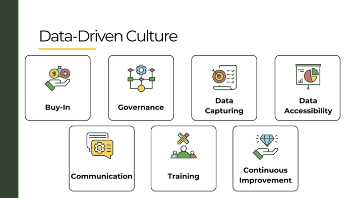 To foster a data-driven culture, construction companies must focus on three key areas:
- Data Capturing: PMIS tools like Procore and eBuilder simplify data entry and enhance data quality
- Data Accessibility: Data warehouses can consolidate data from various sources
- Communication: Develop effective dashboards to communicate data insights – keeping the audience in mind when choosing visuals
Download the SmartMarket Brief
Data Warehouses: The Backbone of Data Accessibility
Data warehouses play a crucial role in making data accessible and usable for construction companies. By consolidating data from various sources into a single repository, data warehouses facilitate comprehensive analysis and reporting.
Some of the many benefits of using a data warehouse include:
- Centralized Data Storage: Collect data from multiple systems into one location
- Enhanced Data Quality: Data cleansing and transformation processes improve the accuracy and consistency of data
- Simplified Data Integration: ETL operations allow for seamless integration of data from diverse sources
- Improved Performance: Data warehouses are optimized for query performance, enabling faster data retrieval
How to implement a data warehouse:
- Data Sources: Identify all relevant data sources, such as PMIS, Excel, SharePoint, and other tools.
- ETL Processes: Develop ETL pipelines to extract, transform, and load data into the warehouse. This involves data cleansing, normalization, and aggregation.
- Business Intelligence Tools: Connect BI tools like Power BI and Tableau to the data warehouse for visualization and reporting.
- Ongoing Maintenance: Regularly update and maintain the data warehouse to ensure data remains accurate and up-to-date.
By leveraging data warehouses, construction companies can unlock the full potential of their data, enabling more informed decision-making and strategic planning.
Best Practices for Dashboard Creation
There are three types of analytics crucial for dashboard creation:
- Descriptive Analytics: Historical data analysis to understand past performance.
- Predictive Analytics: Forecasting future outcomes based on historical data. For example, estimating weekly project progress using past performance metrics.
- Prescriptive Analytics: Providing actionable recommendations based on data analysis. This could involve setting targets for workforce allocation based on project requirements.
When creating dashboards, it’s essential to consider the type of visualization that best suits your audience. There are two main categories data visualizations may fall into: Explain vs. Explore.
Explain Visualizations: These are designed to convey key information quickly and clearly to executives or stakeholders who need a high-level overview. Examples include bar charts, line charts, and pie charts. These visuals should be simple, easy to read, and highlight the most critical data points.
Explore Visualizations: These should be used for someone who may want to delve deeper into the data to uncover insights. They are more complex and allow for interactive data exploration. Examples include scatter plots, heat maps, and more detailed dashboards with filtering capabilities.
Use explain visualizations when:
- Presenting to executives or decision-makers
- Providing a summary of project performance
- Communicating key metrics and trends
Use explore visualizations when:
- Analyzing detailed project data
- Investigating specific issues or anomalies
- Allowing project managers or analysts to explore data trends and correlations
By choosing the right type of visualization for the intended audience, you can ensure your dashboards are both effective and user-friendly.
Case Studies
Here are a couple real-life examples of how Avicado has successfully helped clients streamline their data processes and adopt machine learning techniques.
Case Study 1: Streamlining Dashboard Updates for a Major Client
One notable case involved a large, well-known client who faced challenges with multiple one-off dashboards that required extensive time and effort to update. Each quarter, the client spent hundreds of hours updating these dashboards for executive review. Weekly reports alone consumed four hours per week. Avicado consolidated these disparate dashboards into a few comprehensive, global dashboards.
This consolidation process involved:
- Formalizing Requirements: Establishing clear standards and formats for the dashboards to ensure consistency
- Improving Data Quality: With unified dashboards, discrepancies and data quality issues became more apparent and were promptly addressed
- Integrating Multiple Systems: Data from various sources were combined into the global dashboards, providing a holistic view of the projects
As a result, the time spent on updates was drastically reduced to just a few minutes, enabling the client to focus on data-driven decision-making rather than data preparation.
Read this full case study here!
Case Study 2: Predictive Analytics for Risk Management in Solar Projects
An energy company developing solar plants sought to understand the factors driving project risk. Avicado employed machine learning techniques to identify key influencers of project risk. The insights gained included:
- Utility Sales: Projects intended for sale to utilities were found to have a sevenfold increase in the likelihood of being high-risk or having a fatal flaw
- Battery Energy Storage Systems (BESS): Projects that included BESS were four times more likely to be high-risk compared to those without
By quantifying these risk factors, the client could better anticipate challenges and allocate appropriate contingencies. The use of machine learning provided concrete data to support intuitive knowledge, allowing the company to make more informed decisions about project planning and risk management.
These case studies highlight the importance of reliable, accessible data and how it has helped clients navigate the complexities of modern construction project management. By adopting PMIS solutions, creating effective data warehouses, and developing insightful dashboards, you too can unlock valuable insights to enhance project performance.
If you’re looking for expertise to help navigate the complexities of data management and visualization, get in touch with us!
Get your copy of the Dodge SmartMarket brief referenced throughout the whitepaper!